Many online businesses have professionally designed websites that don’t convert well.
This is primarily due to copy on the page that isn’t customer oriented, while ignoring the importance of optimization for conversion.
Not only are these sites not optimized, tracking the conversion rates to see what conversion events were used to generate interest from prospective clients is usually ignored as well.
buy generic provigil canada What the Real Estate Market Taught Us About Traffic
You probably haven’t thought about it much, but since the introduction of the Internet almost all real estate transactions are started online.
This market is fertile ground to learn from.
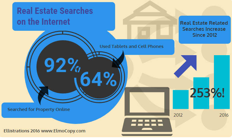
A recent survey conducted by the National Association of Realtors sited that 92% of the consumers who bought a piece of real estate this year, did most of their searching online.
Of that segment, 64% used mobile phones and tablets. Another statistic worth noting was from the search engine giant Google.
In 2012 their study showed that real estate related searches jumped 120% in that year alone.
By 2016 that increase was 253%!
A conclusion could be easily drawn that compelling website copy and optimization for conversion purposes would be very advantageous for any business involved in the real estate market over the years to come.
A small conversion rate could make a BIG difference.
Believe it or not, website conversion is usually an overlooked aspect of marketing.
Most online marketing focuses on getting more traffic rather than converting the few prospects that come to the target sites.
Consider this: Increasing your website’s conversion rate by a mere 1% would boost your company’s profits far better than an increase in traffic to your site ever would.
Digital marketing for online companies can easily be disrupted by not having a clear conversion strategy for their sites.
If the copy and design on the page doesn’t lead the prospect to take a predetermined action, prospects and their interest may be lost very quickly.
For example, your company offers a free downloadable EBook in exchange for contact information.
However, when your prospects come to the site, there isn’t a clear and compelling call to action and an obvious method to sign up, so they get confused, distracted and leave.
At that point it won’t matter how much time or money you’ve spent getting clients to come to your website, because they will be lost.
Using High Converting Factors on Your Landing Page
Factor 1
Create a Great Value Proposition
Your conversion rate is usually determined by the value proposition rather than the amount of traffic you are getting.
Simply put, the value proposition is the main reason why a prospect would buy from you.
Many businesses fail in this area because they are narcissistic in their copy. The prospect really doesn’t care how professional you say you are, how many years you’ve been in business, or how many people work at your firm.
The main thing every prospect wants to know is, “What’s in it for me?” or “How can you solve my problem?”
Your copy has to hit every benefit to the client or customer you can think of as the primary fuel for converting.
Features such as what degrees your staff or agents have is secondary to the primary concerns of how you will be able to help them.
You have approximately 8 seconds to explain to your prospect exactly what it is that you can do for them, and you need to do it in the most dynamic, succinct, and compelling manner possible.
Being able to do so is a highly developed skill that most good copywriters are trained to do.
Creating a converting value proposition requires a lot of contemplation and examination.
You must think of all of your prospective client’s needs and desires, as well as how they aligned to your company’s services.
The ultimate goal of your copywriter will be to identify and refine your value proposition down into an instantly credible sentence that resonates with the prospect’s needs, and spurs them on to take further action.
After this unique value proposition has been crafted, testing must be done on prospects that are ideal to your business.
You need to find out if your finely honed message grabbed their attention enough to take the next step. To stay on top of the game of keeping your site optimized for high conversion, ongoing testing should be conducted over time using metrics from A/B testing as well as other conversion measuring techniques.
Conversion Factor 2
Say it Plain as Possible
Many times, businesses use complex language in order to sound sophisticated. However, statistics and studies have found that toning down the language to an 6th grade level will work better.
Multimillionaire marketer and copywriter Dan Kennedy points out, “Ideally you want your Flesch-Kincaid grade level on Microsoft Word to fall around a sixth grade level, no matter how intelligent your audience is, because it makes your message easier to read.”
Another reason you’ll want to write simpler is so your message will appeal to a larger audience.
Even though you may have sophisticated clients, your online traffic may bring in prospects that are not savvy to your business or its language.
Making readers and potential prospects read copy that’s complex and uses a lot of technical jargon, may be boring and actually scare some of them off.
You’ll want to be as clear and concise in your landing page copy as you possibly can. Many copywriters like to use a device known as “across the bar” copy.
Imagine you’re sitting at a bar with some friends trying to explain your business to them. You probably wouldn’t start talking in all sorts of technical language, using a wide range of data and figures.
You also wouldn’t start bragging to your audience about your proven track record, and how professional you are.
One of the best ways to explain what you and your company can do for them is to imagine that you are talking to a friend ; if you find that your copy doesn’t reflect that, it would be a good idea to have it rewritten.
Conversion Factor 3
Testimonials Are Vital
In the world of webpage copy, testimonials from credible sources are absolutely potent, yet many companies don’t use them.
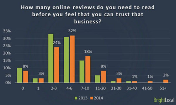
Nothing spells out success to a potential client better than a solid and credible accolade. BrightLocal, a London based search engine optimization company, published a study in 2013 and 2014 that showed 85% of consumers read reviews before making a purchasing decision.
Other parts of the study found that:
- 7 out of 10 consumers stated that positive reviews inspire trust when looking at a product or a business.
- For almost 9 out of 10 consumers, online reviews are just as important as a personal recommendation.
- The implication of this for just about any online business is the fact that accolades and positive reviews are a must. So placing online testimonials on your landing page will definitely help in turning prospects into clients.
How to Make the Most of Your Site’s Testimonials
If you’re going to use powerful testimonials or reviews on your landing page, here are a few suggestions:
Make sure you never use fake testimonials. If anyone ever finds out you have fakes, you’ll have ruined your credibility and it may take years to clear it up.
The rule of thumb in this case is: if you don’t have any testimonials, wait until you have some before using them.
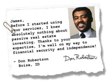
A great way to add massive credibility to your landing page is by posting information about the people that write testimonials for your site.
If you can, try to get as much business information next to the testimonial as possible.
By including the person’s full name, company, where they are located, well as their web addresses, will add massive credibility. Also, include a good picture with the testimonial if you can get one.
Marketing studies have shown that people react favorably to a smiling face when looking at a webpage, especially when it is the face of a woman or a baby.
Also, don’t forget to consider video or audio testimonials. With audio and video, you can share these files and post them to social networks and sites like Facebook and YouTube to get more reach.
Speaking of reach, don’t just place your company’s testimonials in just one place on your home page. Placing them in side bars and at the bottom of the page will help your site to convert better.
The best way to find out if your placements are working well is to split test the pages to see if they convert better with the testimonials in different places.
You should also place some of them on other pages of your site like your “About Us” page as well.
One last thought about using testimonials on your site: make sure that they aren’t just from your upscale clients. You want to give people that have never contracted your services the opportunity to relate to your testimonials too.
The average person coming to your site will not be able to feel as if they’re in the same league if all of your testimonials are from CEO’s and big shots. Even if they are potential clients in your target market, they’ll feel intimidated by what they read and think that your services aren’t for them.
Factor 4
Use CTA’s and Motivators
Like a good copywriter, when you are writing for website conversion, you need to have a good call to action. (Also known as CTA)
If you’re going to get prospects to respond to your sight or business, you need to tell the interested party exactly what to do.
One easy way to do this is to simply have your phone number prominently displayed at the top right hand side of your site with the words “CALL NOW” in big bold letters. You’ll also want to place that phone number in your side bar, as well as at the bottom of your landing page.
However, most prospects need a better motivator than just a “call now” CTA. The most common motivator in getting a prospect to raise her hand is by offering something for free.
This can come in the form of a free video on CD, a free downloadable eBook, white paper, audio file or any other medium you choose.
It can also come as a free gift like a key chain, pen, calculator or any other item you can send in the mail.
If your motivating offer is to get something that will be sent in the regular postal mail, try to tie in the free gift with the sales material that you’ll send them.
Usually, this type of CTA requires an opt-in box somewhere on your landing page where you can ask for the prospect’s contact information.
The prospect responds to your irresistible offer and fills in the necessary information into the fields of your opt-in box; once the information is filled in, that data is saved so you can respond to be prospect either immediately or at a later date.
As you probably already know, the companies that provide this type of service are called auto responders.
These are companies like AWeber, Constant Contact, Mail Chimp, IContact, and Get Response.
What these auto responders will do for you, is collect the contact information that your prospect has filled out on your webpage and save it for you so that you can either follow up with e-mail messages or regular postal mail.
If you offer a free digital product like audio files, e-books, white papers, etc. then you can have the auto responder service automatically send the digital product to your prospect immediately after they fill in their information.
Whatever offer you decide to use to get a prospect to raise their hand and ask for more information, you will usually need to use motivating copy to push the prospect over the edge. One of the best ways to get prospects to respond to your offer and fill in the information is to motivate them with something they desire.
Desire can come in many different forms in website copy. In terms of investing and development companies, motivation can come in the form of financial gain, or fear of losing money or a business opportunity.
If you’re selling an online social media course, desire could be getting ahead of your competitors or attracting loads of prospects from networking online.
When I speak of fear as a motivating factor in getting your prospect to raise their hand and ask for more information, I’m not just talking about money loss, getting sued or situations like that; I’m also talking about losing the opportunity that you are presenting.
For example, on your website’s landing page you can have a free offer for a report or course that will show your prospect how to make or save money using your services.
However, if they don’t fill out the information within a specified period of time, they may lose the opportunity to get the free report or course that you are offering them.
This is a realistic way of producing fear in the mind of your potential client, so that they will want to sign up for your free e-book or report or even e-mail series.
There other ways to use fear as a motivating factor, such as letting the prospect know about economic situations that may affect their current investments.
I ‘m not telling you to make this up, but as you well know, there is always the opportunity for a downturn in the economy, so telling your prospect that they may want to capitalize now while the market is good, is not an unrealistic scenario.
To give you a good, clear example of this, an insurance company recently tested an e-mail subject line stating; “$20 Million Homes Burn to The Ground!” Versus “Protect Your Home, Wildfire Season Is Coming!”
The “burn to the ground” subject line generated 65% more leads than the other subject line. The statement was true and verifiable, and the threat was real; this was a case, where a company used fear in their copy that was ethical and produced revenue.
The honest thing to do when using fear-based motivation, is to make sure that the fear you are using is not fake but a real possibility.
If the fear factor is legitimate and you’re not making anything up that is fake, then you can use that as an advantage to sell. This is one of those situations where you’re going to have to step back and decide whether or not you want to use this tactic or not. If these decide to use this tactic, you are going to have to weigh it out, and decide whether or not it is fair and ethical for you to use it. Sometimes, it is entirely ethical to let people know that there is a possibility of a particular danger and that you have a solution to help them.
Another great motivator to get people to respond to your offers is to use result; this is one of the reasons why testimonials are so important.
If you can have credible and verifiable testimonials on your website this is proof that your business can deliver on the promises it offers.
Also, if you have a track record of success and can put it into a chart or graph this will also speak volumes to your audience and in return you can use that in a call to action.
For example, “Join the other 700 successful entrepreneurs that have used our system by simply giving us your e-mail and pressing the submit button right now!”
This message can be placed right on your opt-in box above or below the information fields that need to be filled out.
Factor 5
Make Your Landing Page as Brief as Possible
Another important thing you need to keep in mind about building your landing page is to keep your copy as brief as possible.
You want to make sure that you are keeping your end goal in mind, which is to get your prospect to raise their hand and say “I’m interested in your business”.
If you put too much information on your landing page it will do nothing more than confuse your prospect and it may just drive them away.
The best way to get results on your landing page is to simplify everything that is written on that page. One of the best ways of doing that is to use bullet statements.
Bullet statements make your copy much easier to read and much clearer. Please bear in mind, that you want to create bullet statements that either show how your business and services will solve a problem or fulfill a wish that the prospect is looking for a solution to. For example an investment company might phrase their copy like this:
Our investment firm will :
- Educate you and show you the best ways that you can invest your money
- Give you daily updates on how your investments are doing
- Send you investment tips on how you can improve your portfolio
- Connect you with other investors so that you can learn from other investors just like you
Putting it All Together
When I put this white paper together, I wrote it with the idea that it was probably going to be read by up-scale businesses like real estate developers, investment firms, accounting businesses that were satisfied with their landing pages.
However, many executives don’t pay much attention to whether or not their sites are converting visiting Internet traffic into clients. Hopefully, this paper has enlightened you to take a different course of action.
The main reason why many business leaders would not want to give their landing page a complete make over is because it is an area of marketing that they are not familiar with.
Not only that, but when you are getting a landing page redesigned you are relying on the web designer to steer you in the right direction.
Unfortunately, web designers are not copywriters or marketers, and they usually create sites with aesthetic designs in mind.
With this report you could read it and then implement the ideas presented here by merely changing the words on your website’s home or landing page.
You could very easily have a copywriter rewrite and submit the ideas I have given you to your webmaster and he could change it in an hour; changing the words on a website is a simple process.
However, it is the skill and experience of rewriting the copy on the page that’s difficult.
Just to make sure I’m covering all the bases here, I’m taking the liberty of giving you a clear example of what a high converting landing page looks like. (Just in case you want to give yours a high conversion makeover.)
I’m going to break down each component so that you’ll understand how it all fits together. I would also like to mention that I did not look at the following example as I wrote this piece.
I wrote this material based on experience, resources and education I have cultivated over the years.
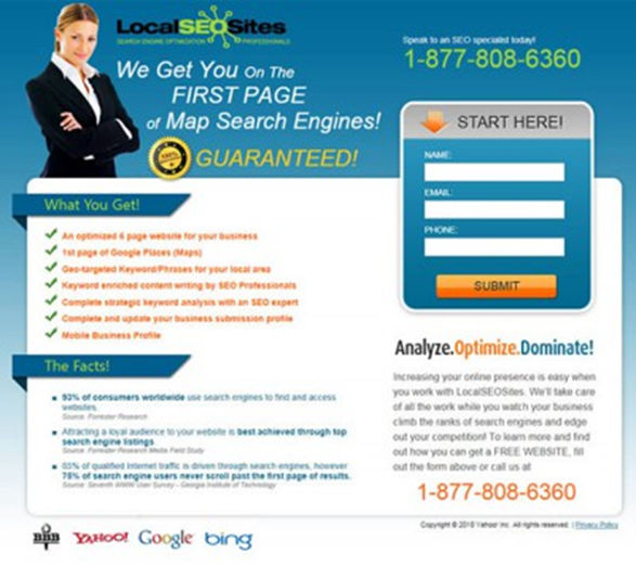
I was quite relieved when I discovered that my ideas and descriptions fit in accurately with the high converting page below:
If you look at the example above, you’ll see that many of the components that I have been talking about are on this landing page. Not only that, but there are a few other elements here that bear mentioning.
- Starting at the top, you have a picture of a woman smiling. As I pointed out earlier, studies have proven that people react favorably to pictures of faces, especially when they are women or baby’s faces.
My recommendation for this would be to have the owner of a company or an executive from that firm in the picture, dressed for business, with the company’s staff behind him or her.
People like doing business with people that they know. Having your photo on the page gives prospects the opportunity to get to know you.
Do not use a stock photo! Your Internet traffic is probably very Net savvy, so they will have more than likely seen many of the stock pictures that reside there. Having stock pictures will seem a bit fictitious if your prospect has seen them before, so get real pictures of yourself and staff members on there.
- The business’s phone number is in the upper right hand side prominently displayed and also at the bottom of the page; so it’s one of the first things you’ll see when you read the page and the last thing.
Just above the phone number is the CTA that says, “Speak to an SEO Specialist Today!” which could have been done in larger letters.
- This site is using a headline that not only tells you exactly what the site is about immediately, but it is leading with the biggest benefit to the prospect, which is “getting you on the first page of map search engines”.
Having a headline like this is incredibly effective and will easily increase your conversion rate if it is researched and written properly.
- The bullet points with the top benefits are in orange with green check-marks on them.
Once again, studies have proven that people notice and react to the color orange more than any other color. (This is why city workers are required to wear orange uniforms so that drivers will see them better when they are working on streets and roads.)
Using this color on the bullet statements is no mistake. Not only are the benefits being shot at you with short, punchy bursts of information, but your eyes will be drawn to them as well.
- I’m sure you’ve noticed that there is a guarantee right under the headline. (Not only that, there are several symbols underneath the body of the page, one of which is from the Better Business Bureau (BBB).)
- Guarantees are important to have on your page because it shows that you are willing to back up your offer and “put your money where your mouth is”.
The symbols underneath the body of the page create credibility as well, even if there is no clear connection in the mind of the prospect as to what they are there for.
Other than the Better Business Bureau’s symbol, there is no reason for the search engine symbols to be there other than to indicate that the business is optimizing for those search engines.
- The opt-in box on the right (sometimes called an opt-in form) uses a call to action that says, “Start here!” As you can see, the call to action is amplified by an orange arrow. (There’s that color again!) It also has an orange submit button that tells you what to do. Whatever you do, do not make your form too long. The less a prospect has to fill out to take action, the better.
- Finally the words “Analyze, Optimize, Dominate” bring your attention to the last section. This last section is where Local SEO Sites gives you their irresistible offer. In this case, the offer is not only a first page ranking, but also a free website.
If you can offer a prospect something in lieu of everything else you are offering them to sweeten the deal, chances are they will fill out the contact form.
Conclusion
As you can plainly see, there’s quite a bit you can do to raise your response rate on your website.
Of course, you don’t have to do everything in this report, but doing some of them will definitely improve your response percentages.
If you have to spend money on improving your site, hiring a decent copywriter is the way to go. Copywriters fully understand many of the elements that compel people to take action and respond to what you have to offer.
Not only that, they will also have a firm grasp of how to test copy and change it.
To Your Continued Success!
 Mark “Elmo” Ellis is a freelance copywriter that lives next to the Valley View Ferry in Richmond, Kentucky. He has a BA in Music Education from Lynchburg College, and an MA in Educational Technology from Boise State University.
He has lived and toured as a jazz trombonist extensively all over the world with the United States Army Band, and has a real passion for music, art, and writing
You can read more about how you can promote and market your business by reading the blog on his website at: www.elmocopy.com
You can also follow him from one of these social media sites: Elmo’s Facebook Page, Mark Elmo Ellis’ Google Plus Page , and Elmo’s Twitter Page .
Listing of Services:
Sales Letters – Donation and Fund Raising Letters – Advertising Copy – Yellow Page Ads – Magazine Display Ads – Video Sales Scripts – Effective Blog Posts – Email Campaigns – Banner Ads – Marketing Consultations – Public Speaking
For Consulting and Copywriting advice, please contact me here:
elmo033057@gmail.com
or call me: (859)797-9560
