Usually, whenever I see advertisements for private schools, I can’t help think that there was little thought put into them. I don’t want to sound harsh, but I’d like to give you an honest evaluation of what I’m seeing, while offering you some valuable insights on how you can improve your own ads.
When creating a magazine ad for your Christian college or private school, you have to think the entire process through, much the same way an advertising copy writer would before he sits down to write a single word.
Elements Your Ad Simply Can’t Do Without!
You have to consider the elements that should go into your advertisements BEFORE you start creating one. For example:
- What is your school’s biggest and most important benefit? Is it the safety of your school? Do you have an incredible technology program? Are students getting fed spiritually as well as academically? Will the students have higher test scores? You need to sit down and assess these.
One of the best ways of doing this, is to run a yearly survey. At the end of the school year, ask parents and students what they thought was the most important facet or benefit of your school. You really need to dig deep and ask a lot of questions and tell the respondents to be frank. You also want to know what they didn’t like as well. This will give you loads of incredible information which will be essential to your marketing.
This is probably the most important part of your ad, because you want the reader to immediately know what you are all about. People usually scan before they actually read an ad, so the quicker you can get your main benefit across, the better.
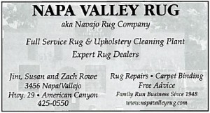
Here are some examples of great ads that communicate immediately what they are about:
There is no question what this business is about and who their target audience is. Their biggest benefits are they clean and deal in rugs. On the lower right side of their ad are the other important benefits and services that they offer. Their target market is people that need their rugs cleaned and repaired, and they are experts at it.
Let’s look at another ad:
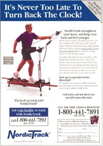
What is the benefit of NordicTrack? It’ll make you look and feel younger!
The biggest benefit is implied in the ad’s headline. Notice that the headline doesn’t state the benefit directly but skillfully generates curiosity and then spells out the next biggest benefit in the body copy. This is done so on purpose, so that you’ll read the rest of the ad ― “NordicTrack strengthens your heart and helps you to look and feel younger.”
So, you need to know your school’s biggest benefit, and display it prominently in all of your advertising.
- Who is your target audience or market? Marketing to everyone is marketing to no one. Are you trying to reach students and parents that are in a particular income range? Is there a particular part of town that you want to focus your advertising efforts on? What is the language and culture of the people in your area? What are they interested in?
The more you know about your target audience, the better off you’ll be and the less money you’ll spend trying to reach them.
It’s no mistake that politicians will have their hair cut or styled the same way that their target audience. They will also adapt their language to the people they are romancing because they have master marketers advising them to do so.
You need to understand and know everything you can about your target market and how to relate to them. I live in an area where a university is extremely important to the local economy, and it’s almost death for a business to ignore this culture. I’m not telling you to be phony, just smart. The schools and colleges that really get this, will do very well.
- What other important benefits does your school offer? Once again, your survey will give you all sorts of ideas and insights as to what parents and students think about your school. You need to present as many of these in the copy of your ad as possible.
If you’re running a small ad, make sure that you run your biggest and most important benefits, even if it is only one or two.
Here’s an example of a small, effective ad:
Once again, within a matter of seconds, you know exactly what this school is about and what the main benefits a student attending there will receive. At a glance, you can see the benefits of sending a student there and what the school represents. They put a call to action in there, even though there is not much room to work with.
In this case, I would have put the school’s phone number in large font, right under the call to action.
- Calls to action. If you look back at the NordicTrack ad, you’ll see a definite call to action there. “Call for free video and brochure” and then it gives you a 1-800 number to call in large, bold letters. Many of the ads I see produced for private Christian schools, don’t have anything other than an address and phone number in very small print.
A good call to action asks the prospect to do something as soon as possible. If you watch any of the infomercials on TV they’re usually asking you to do something almost from the get-go while they are demonstrating their product or service. There is usually a 1-800 number displayed telling you to CALL NOW!
Usually, they’re also offering you free information that you’d be very interested in hearing.
A good idea for your school, would be to offer a free report, DVD with more information, or other item, just for responding to the ad.
If you use an enticing call to action, you’ll get more of a response from prospects, especially if you offer something free of value to them.
“Call Us Now for our Free Report –10 Easy Ways to Increase Your Child’s Learning Capacity, Overnight!”
What parent wouldn’t be interested in that? Creating a report of this nature is very easy to do, and you could easily have it printed, bound and ready to give to prospective parents and students when they walk in the door.
- Contact and other Important Information. – If you include a call to action on your landing page, you should have a very easy way for the prospect to contact you for more information. The easiest way to do this would be to have a phone number
Real-World Examples of Ads and Websites That Could Be Better!
Let’s diagnose a few ads and websites from schools and see how they can better their copy elements.
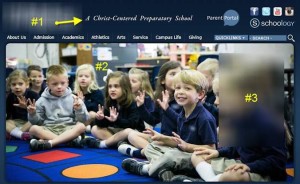
This is the landing page from a prominent Christian school’s website. (I’ve blurred out the name of the school.) Since you’ve only got a few seconds to grab your prospect’s attention, you need to communicate benefits and generate curiosity in your school fast. I fa a prospect can’t find a good reason to stay, they will merely click the mouse button and move on to another site.
This is usually what you’d see on just about every private school’s website. Considering the fact that many schools use their websites as their primary PR tool, wouldn’t they want to use it to the fullest extent to generate interest?
#1 Biggest Benefit -Since the school already has “Christian School” in its name and logo, they really don’t need to reiterate it in the top of their site. They could have led with their biggest benefit in a large font right up front, or they could have combined the Christian message with their biggest benefit.
Example: “Christian Based Education – in a Safe, Fun Environment!”
#2 Big pictures look nice, but they don’t sell as well as well written copy. Some of this landing page’s real estate could have been used to hammer out the other important benefits the school has to offer. You can still use pictures effectively, but you can also superimpose the benefits and copy over the image.
Surveys have found that smiling faces do sell, so using them is important. Just don’t sacrifice your entire page to that element.
#3 A way to collect contact information / Call to action (CTA). On websites, you should always have a method of collecting contact information from people visiting your site. Websites usually use a tool called an “autoresponder”. What an autoresponder does, is it collects contact information from people that visit your website, and keeps all of the information in a database for you.
Not only that, but it will send an automatic message back to the individual that signed in. Pretty cool, eh? You can get this type of messaging service from several different services on the Internet.
#4 Testimonials – I didn’t label where this should go because it can be placed basically anywhere on the page. However, testimonials can really add to the credibility of the school and add a personal touch prospects can relate to. Testimonials are very easy to get from parents and students but their impact is super effective.
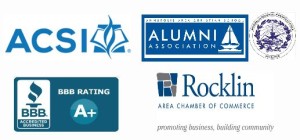
#5 Labels and symbols of authority. If your school belongs to any type of organization or association, you should put those in your ads or on the landing page of your site. The power and effectiveness of them are huge in the mind of your prospect. Seals and symbols of trade organizations and associations have the same impact as testimonials.
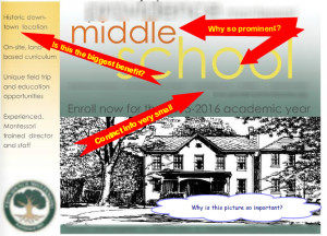
Let’s take a look at a print ad from a magazine. This was a half page, full color ad, so I imagine the school paid quite a bit of money to run it.
(Once again, I blurred out the school’s name and contact information, and I would like to reiterate that this critique has no bearing on the quality of education you would receive from the institution. I’m merely pointing out obvious marketing errors.)
The ad has a “cool” design, but does it sell?
I’m not sure why “Middle School” has to be in such massive lettering that it eats up almost the entire ad, but the advertisers must have felt it was extremely important as to put so much emphasis on it. I get the idea that this school wants to make sure that you know it is a middle school, but does it really need to go to this extent?
“Historic Downtown Location” is a feature and NOT a benefit. A feature is personal preference that really adds little value to the item. (Like the color of the building, shape of the item, etc.) Benefits are what the product or service will do for you and they should be your main selling points. Like:
Will the school…
- Make your child smarter?
- Encourage critical thinking skills?
- Provide a safe environment?
- Add Christian values to lessons?
- Encourage discipline and regimentation critical to success?
Once again, your copy should be loaded with benefits, starting with the biggest one your school offers.
I also found that the contact information on this ad was very small. The school does have a prominent call to action (Enroll Now…) that should have had the phone number displayed in large numbers next to it rather than very small text on the line above it.
Finally, the picture of the school appears to be a hand drawn, pen and ink illustration that does nothing to sell the school. As a matter of fact, it looks like the school is in a residence, rather than a normal school building, which may be a turn off for some parents.
Surveys have shown that ads like this pull a much better response with pictures of happy, smiling faces on them. People relate to faces, so a scene where there are happy children learning and performing an activity on them are much more effective.
Now, let’s contrast this with another ad from the same magazine. This ad is much better, even though it was a lot smaller than the previous one.
Considering that this ad was an eighth of a page in size, it’s super effective!
Immediately you know what this school represents, and what the main benefits are. (As a matter of fact, there are seven of them.)
The picture of the child smiling in a classroom environment will relate well to prospective parents. The only thing I would change considering the size of the ad, is to make the phone number bigger, with a short call to action next to it!
Call today! – (xxx) xxx-xxxx
Massive Tips That’ll Make Sure Your Ads Will Get Seen!
Here’s a couple other ideas that will make your ads much more effective.
Consistently run them. When people see your ads over and over again, time after time, it spells out the fact that your school is a lasting and enduring institution that is here to stay. It means that you are not just serious about your business, but you’re setting the standard for others to follow.
Also, it usually takes about none or ten exposures before your ads will begin to register in the minds of prospective parents or students.
Make sure you run your print ads in the right publications. If you’re running your ads in a magazine that doesn’t have other schools running their ads, then chances are you are in the wrong publication. Check around and find out which publications would be the best fit for your school BEFORE you run your ad.
Test your ads constantly. Change different elements of your site or advertisement to see if it pulls more response. Sometimes changing the color of the text or having a different call to action can make all the difference in the world!
Here’s a real-world, clear example. A business was selling a music item years ago. The first ad had a headline that said:
“Put Music in Your Life!”
The second ad the company ran said:
“Puts Music in Your Life!”
The second ad pulled a much better response because the word “Put” indicated effort, while the second ad’s “Puts” indicated it was done for you and required no effort.
No kidding. So, testing to see what works and keeping track of it is super important.
Make your ad look bigger by using a border. Borders around your ad will make it seem bigger, so it is a good idea to use them especially if your ad is an eighth of a page in size or smaller.
Don’t just use capital letters. Believe it or not, all caps make it more difficult to read.
WELCOME TO ALFRED JONES CHRISTIAN SCHOOL
Welcome to Alfred Jones Christian School
See the difference?
Make sure that you use a strong headline. This is where a good advertising copy specialist will come in handy. If you can, try to include at least two of your school’s best benefits in your headline while trying to create curiosity.
Write as if you are speaking to one reader, rather than a crowd. People like to feel as if you are relating directly to them, so when you write anything on your ads, try to make sure it sounds like you’re talking directly to the person reading the material.
Try to get your ad placed on the right hand side page in the top left corner. People’s eyes usually go to this area first, so they will see your ad if it is placed there immediately. If you are just running a website, try to get your most important information and benefits into the top, left hand side of your site.
Internet based companies have used eye tracking software that record the motion your eyes make and then present the movements in a graphic called a “heatmap”.
The results have shown time and again that people’s eyes move in an “F” pattern when they look at a website, and it probably isn’t any different with a magazine ad. If you look at the image below, you can see that people’s eyes start in at the top left side of a page and move right.
Obviously placement is very important for your ads, so make sure you have them right where you know people will be looking for them.
If You Follow These Tips and Take Action – You’ll Blow Everyone’s Mind!
If you follow the advice I’ve given you on this page, you’ll be light years ahead of most of the schools in your target geographical area. There’s an old saying that I just love to use,
“In the land of the blind, the one eye man is king.”
If you have knowledge that everyone else doesn’t have, and know how to use it, then you’ll be the go-to person at you school. Your school won’t be wasting money, chasing blind marketing ideas or just randomly placing ads.
I’ll be writing more articles on the subject of marketing your school, so bookmark this blog and refer to it when you need to.
Give Me a Call – I’m Sure I Can Help You!
I’m also available for free consultations if you’d like to give me a call, or send me an email, my contact information is:
Mark “Elmo” Ellis elmo033057(at symbol)gmail.com (859) 797-9560.
My area of specialization is writing advertising copy, so I can easily help you write copy for your ads or website that’l entice prospects to want to know more about what your school has to offer.
Call or email me today!
God Bless!
Mark “Elmo” Ellis
